Beach Road Deli is the top spot for coffee, bagels and pizza on the Kāpiti Coast.
The Deli crew wanted to update their logo and signage, business cards, menus and to create visuals for their new app.
Words Are Weapons was an exhibition I had in 2016. I created an alphabet from laser cut acrylic letters and lit some of them up with help from FabLab Christchurch. I also developed a lettering artwork series using acrylic and vinyl on ply.
Tuhia ki te Rangi / 2020 / Street Prints Mauao / Tauranga, New Zealand / from the Te Rautini song
New Zealand Trade and Enterprise / Bigger, Better, Faster / 2019 / Christchurch, New Zealand
TMD / 2021 / TMD exhibition at the Dowse Museum / Lower Hutt, New Zealand / with TMD crew members
In the Blink of an Eye / 2011 / Christchurch, New Zealand / with Wert 139
Accent Construction / 2021 / Auckland, New Zealand
We Got the Sunshine / 2013 / Christchurch, New Zealand / with Olivia Laita / Photo: Elliot O'Donnell
Trade Aid Chocolate Factory / 2014 / Christchurch, New Zealand / with Grace Fairhurst
Bright Black Sky / 2016 / Christchurch, New Zealand / with Adam Starnes
Chase the Clouds Away / 2016 / Christchurch, New Zealand
Words Are Weapons / 2018 / Modesto, USA / Photo: Jeffery Guichelaar
Small Victories / 2018 / Wellington, New Zealand / with Leser1, Sean Duffell, Larissa McMillan, Otis Chamberlain
Sky is Falling / 2017 / Kāpiti Coast, New Zealand
Rain Dance / 2018 / Dunedin, New Zealand
Hand lettering.
A selection of logos I’ve developed over the years.
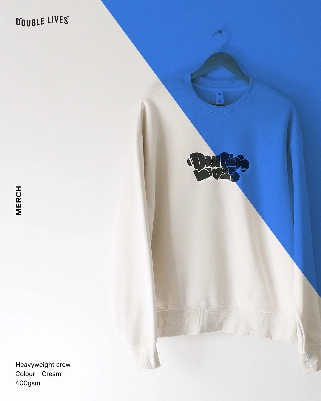
Double Lives exists to support female expression in hip hop culture. I developed this platform to connect women in hip hop and to provide a space to tell our stories, encourage each other and hopefully be inspired! I developed a logo, brand style, merch, and social media plan. The full website can be found here: doublelives.co
In 2020, I had the opportunity to paint a wall in the foyer of the Māngere Arts Centre, at the time my local community arts hub. This project was coordinated and facilitated by Aotearoa Urban Arts Trust — big thanks to Livi, the crew at MAC, and to my nephew Tala for company, entertainment and a little help. This mural is dedicated to my mum, Carol, who has always been the biggest inspiration in my own creativity.
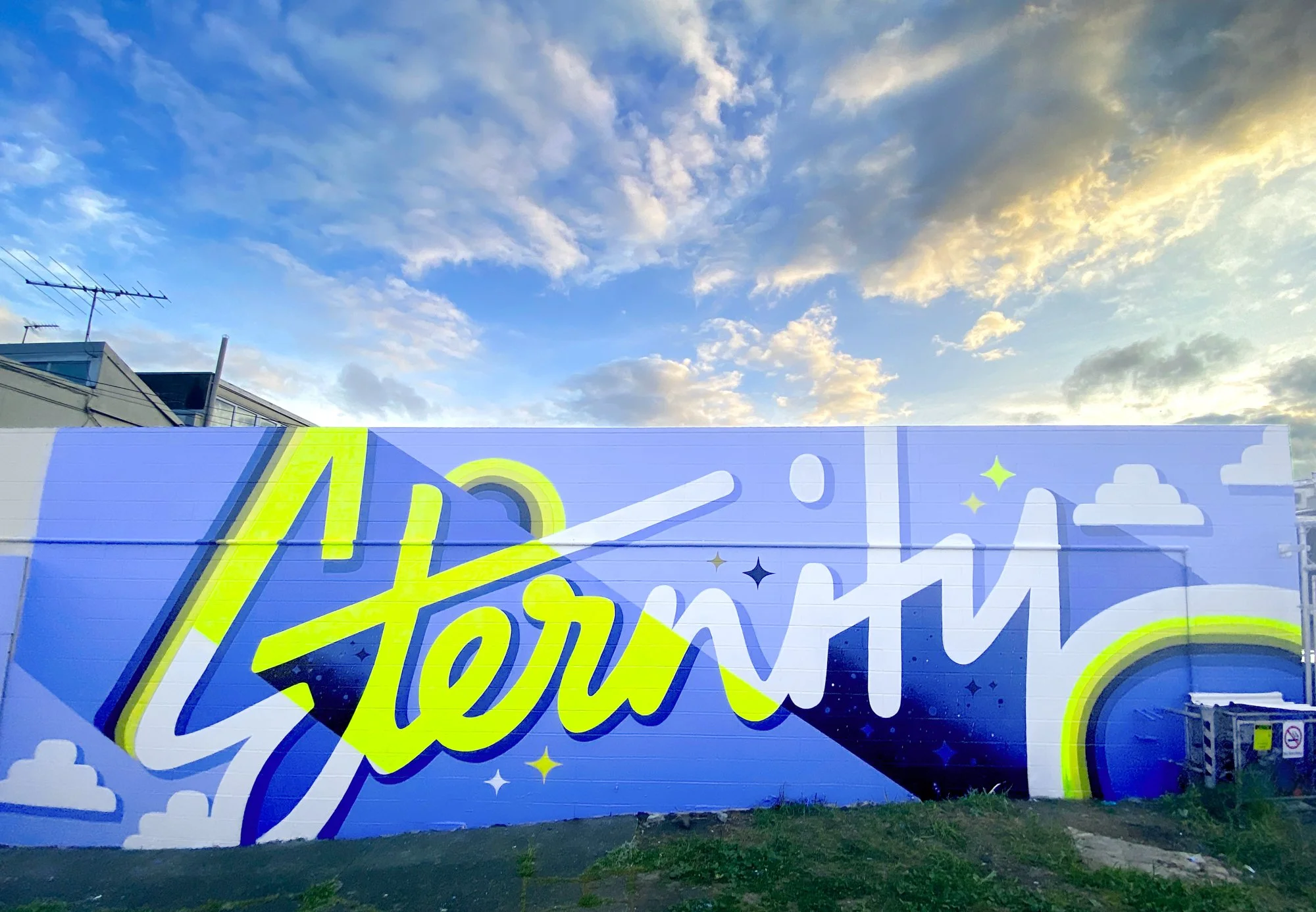
I painted this wall for Bradley Lane Project 2020, in Glen Innes, Auckland. The inspiration for the word ‘Eternity’ come from the life and message of Arthur Stace, a Sydney man born into poverty, who became an alcoholic before converting to Christianity. The word ‘eternity’ was etched into Arthur Stace’s mind and he felt a call from God to write it on pavements all across Sydney. I love his message and I hope that what I write on walls can have an impact to some extent in the same way Arthur Stace’s Eternity did.
Typography is what language looks like and is the way we form language into pictures. As designers, one of our primary means of communication is the written word. We’ve been taught about how to communicate a visual message as effectively as possible, but communicating through written language can be challenging, and can sometimes go really wrong!
For this project I looked into some of the ways miscommunication occurs in written language. I decided to explore two areas of visual miscommunication that involve typography.
The first component of Mis/Communication is called Not My Type and describes the multiple personalities of an alphabet of letters. It is based on the idea that we perceive personality in fonts and considers what might occur if these letters were as complex, inconsistent and unexpected as humans can be, and if they couldn’t always be judged according to their appearance.
The second component is called More Than Words. This part of the project is an exploration into how we can use type as image to evoke emotion and convey a message more effectively than by just what the words themselves say. I used the ‘miscommunication’ angle for this as well, taking quotes that said one thing and using typography to create an image that makes them look as though they say something completely different.
The project was a finalist in the Best Design Awards Graphic Design Student Category.
Thank you so much to Dave Corbett at Corbett Neon in Christchurch for making my awesome neon sign, I will no doubt be back for more!
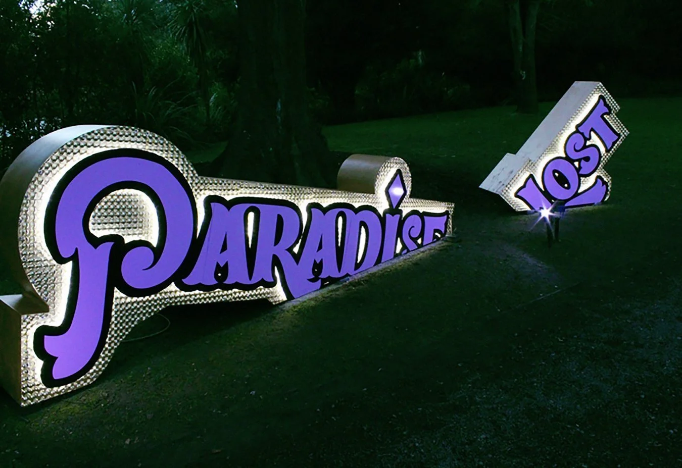
I’ve always loved neon and illuminated signage. In 2016 I was invited to be involved in the fun and dynamic light festival, Botanic D'Lights. The theme was Lost in Vegas, and fit well with concepts I had been working on at the time. I was commissioned to design three typographic installations, which were then brought to life by the team at Ara Institute of Technology, FabLab Chch and Spectrum Lighting. The other lightboxes are a selection of artworks I created for various exhibitions and for my own wedding.
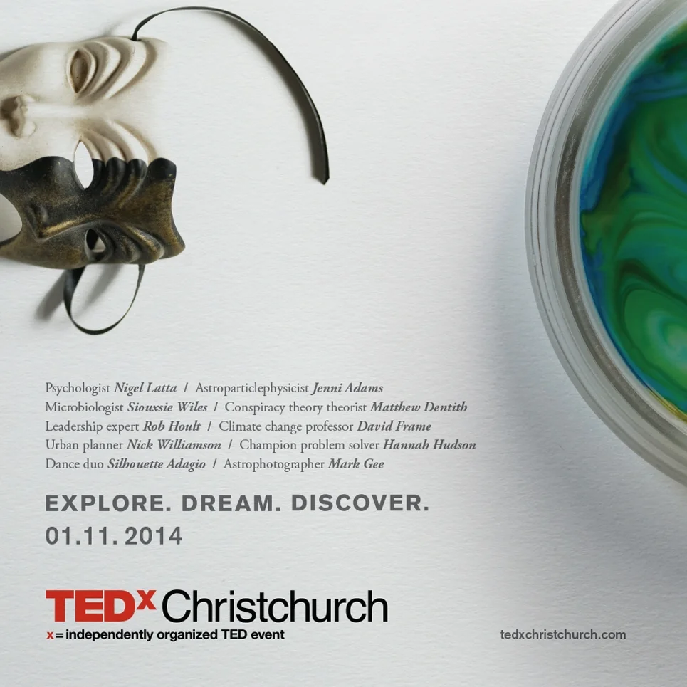
In 2014 I worked on branding the one-day conference TEDxChristchurch 2014, Explore, Dream, Discover. I thoroughly enjoyed working on this project — the conference itself was awesome too.
The majority of the work went into the conference booklet; I developed visual profiles to represent each of the speakers and their presentation topics. This was a lot of fun and allowed me the opportunity to develop my photography and photo-editing skills.
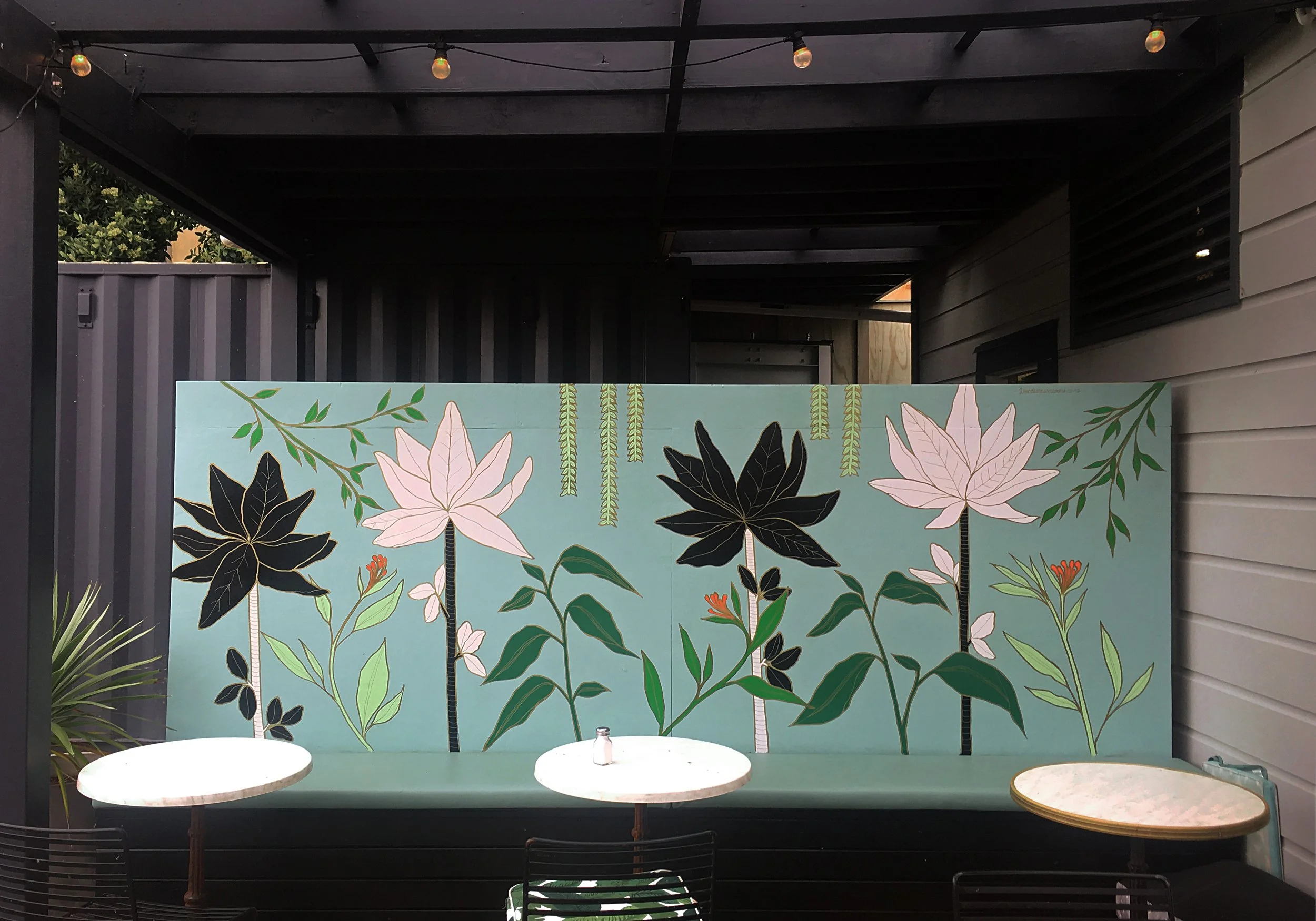
I painted this Japanese-inspired wall of plants for vegetarian cafe and restaurant, The Botanist, in Lyall Bay, Wellington.
I painted this Paekākāriki Paradise Beach Road Deli wall to welcome hungry and thirsty walkers to Paekākāriki after they’d completed the Escarpment walking track. The deli incorporated the design into more of their branding collateral as well — including stickers, postcards and apparel.
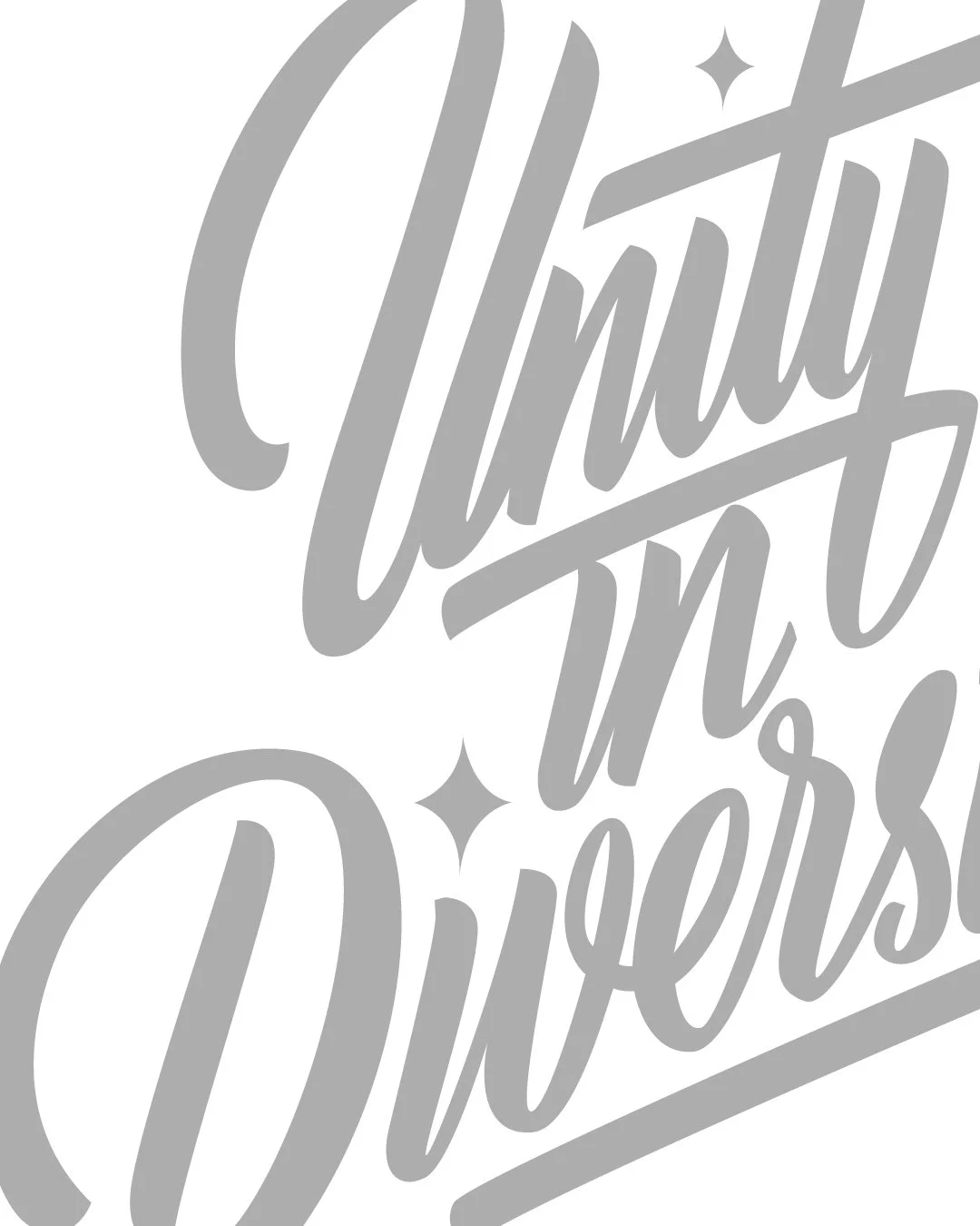
I painted this wall early 2022 in the Brickworks and entertainment section of Lynn Mall, in New Lynn, Auckland. The abstracted graffiti letterforms with their individual character reflect the diversity of the people of New Lynn all coming together in one place. I found the public response to be the best I’ve experienced while painting, so many positive comments and words of encouragement from a really diverse range of people. Thanks to Ross Lieu, the New Lynn mall crew and the cool people of New Lynn.